Button element

Buttons are elements that trigger a function when pressed, e.g. control a device. Insert a button by dragging the button symbol onto the remote page. Buttons can trigger actions and/or display a status. With buttons you control actions like device functions, page switches, macros and more. Additionally you can visualize the device status. You can find out how to assign actions and statuses in the chapter: Assign action and status. Similar to images, you can also create status rules for the button icons.
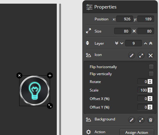
Button image structure: Background and icon
The visual design of the selected button can be assigned in the properties menu. Button images can consist of two images for background (universal button area) and foreground (function icon), but it is also possible to use just one of them. To indicate the status you can only use the icon (foreground image).
Replacing images for several buttons at the same time
It is possible to exchange multiple icons or background images for several background images in one step. To do this, you can select all the buttons using the multiple selection function (hold down the CTRL key). Then simply select the desired image in the properties menu. Now the same image will be used as the background or icon image for all selected buttons.
 DE
DE